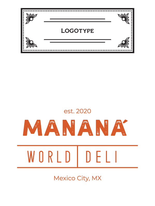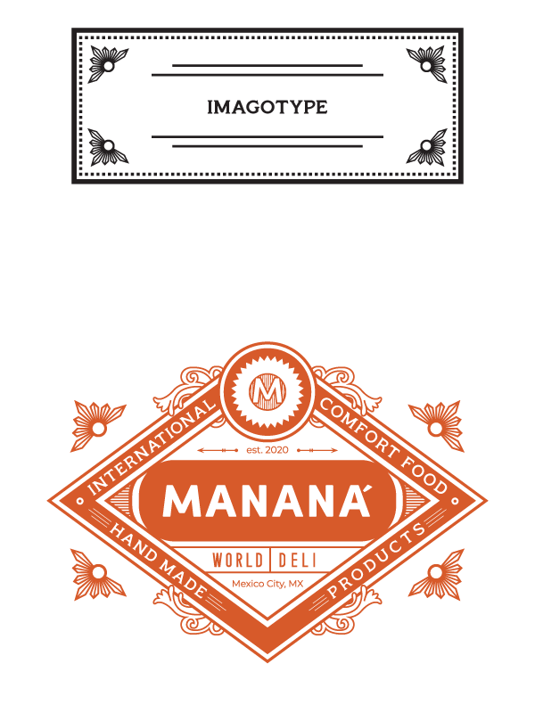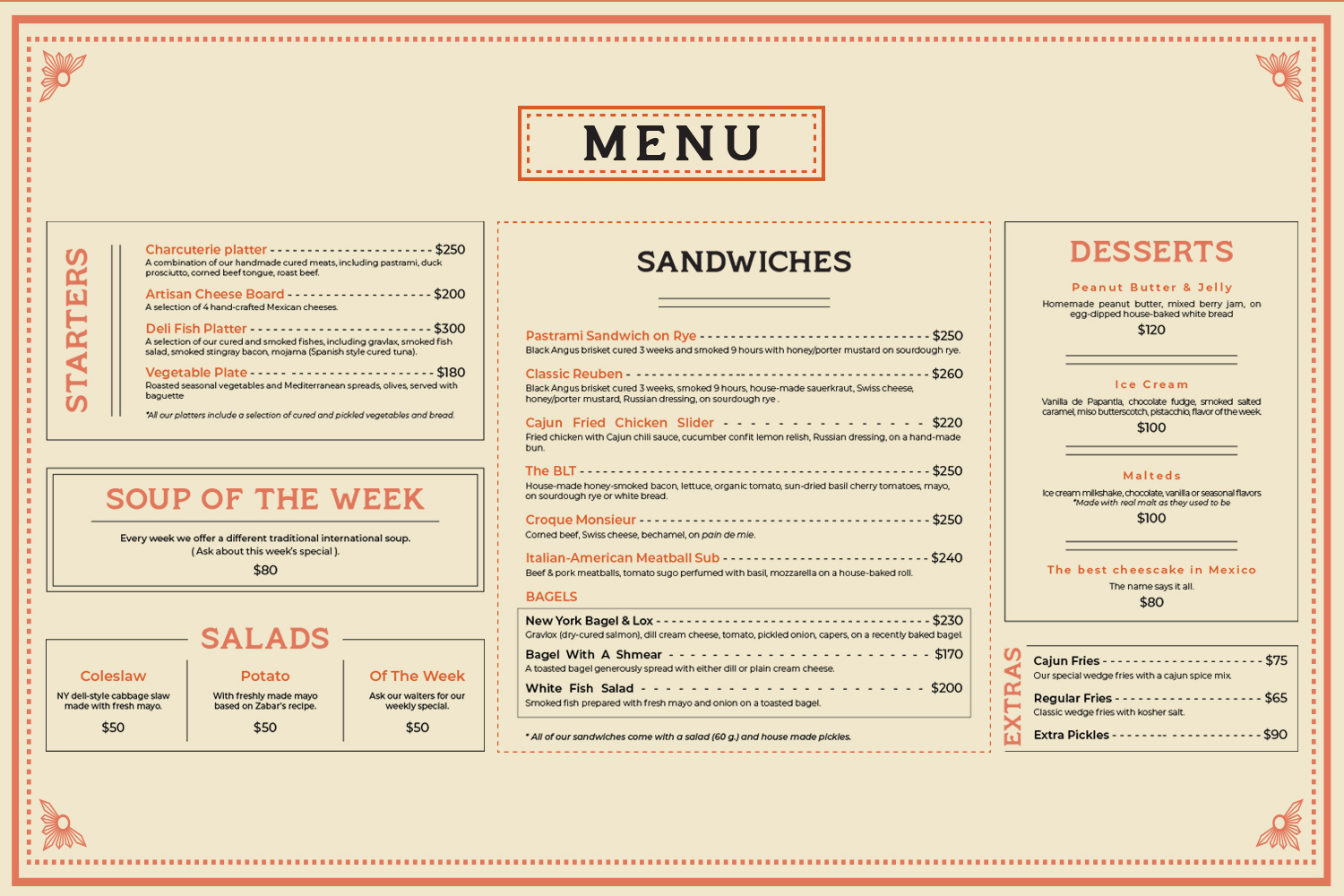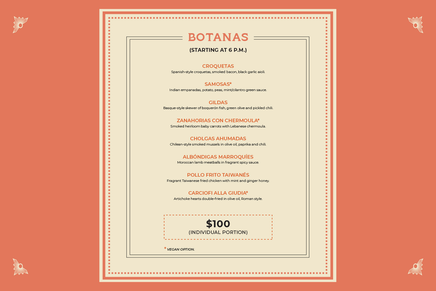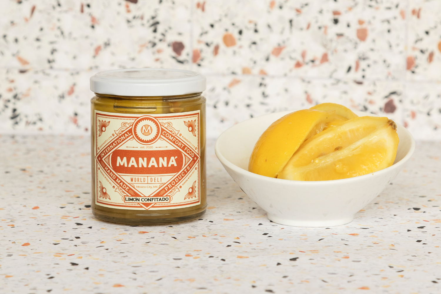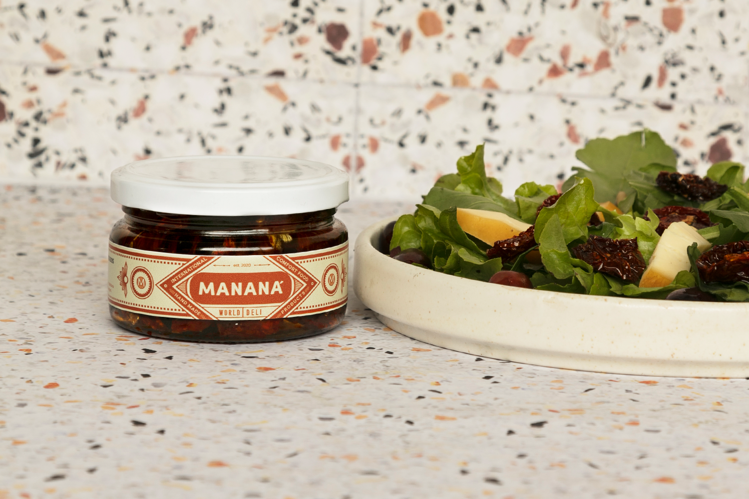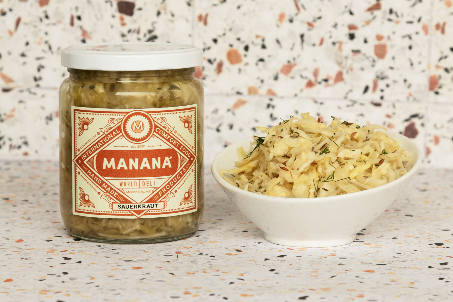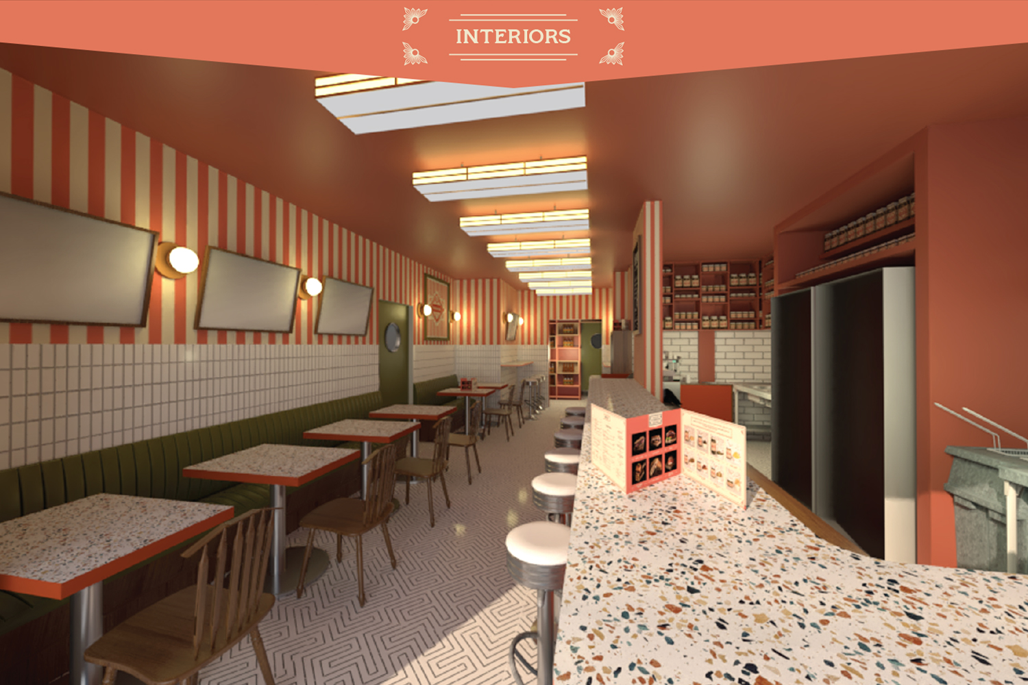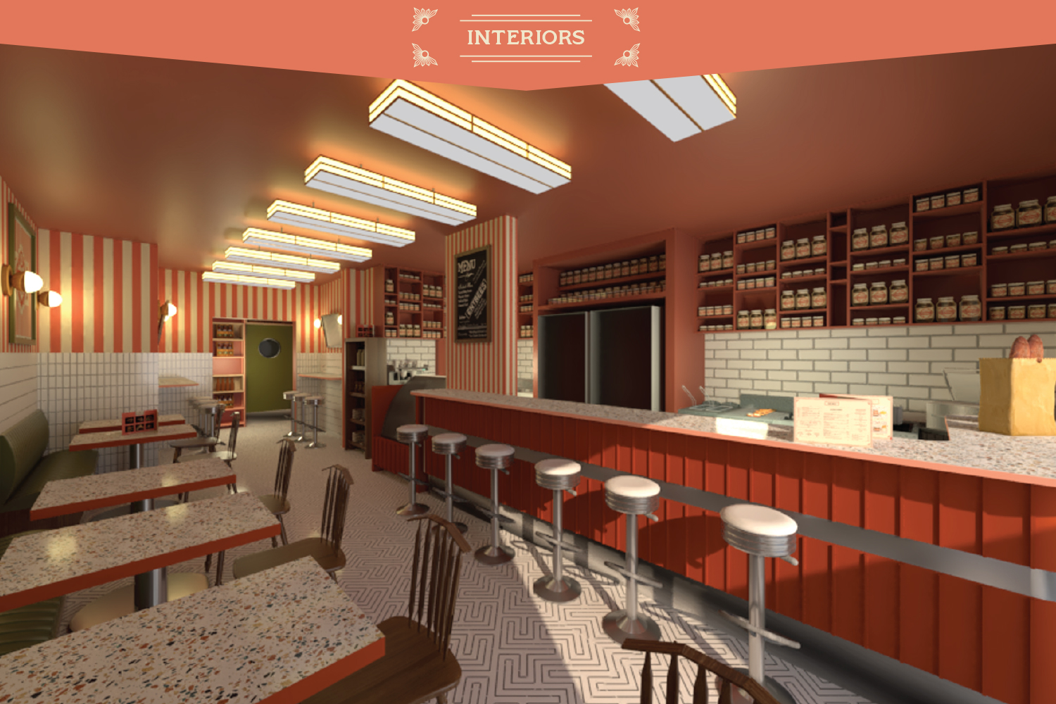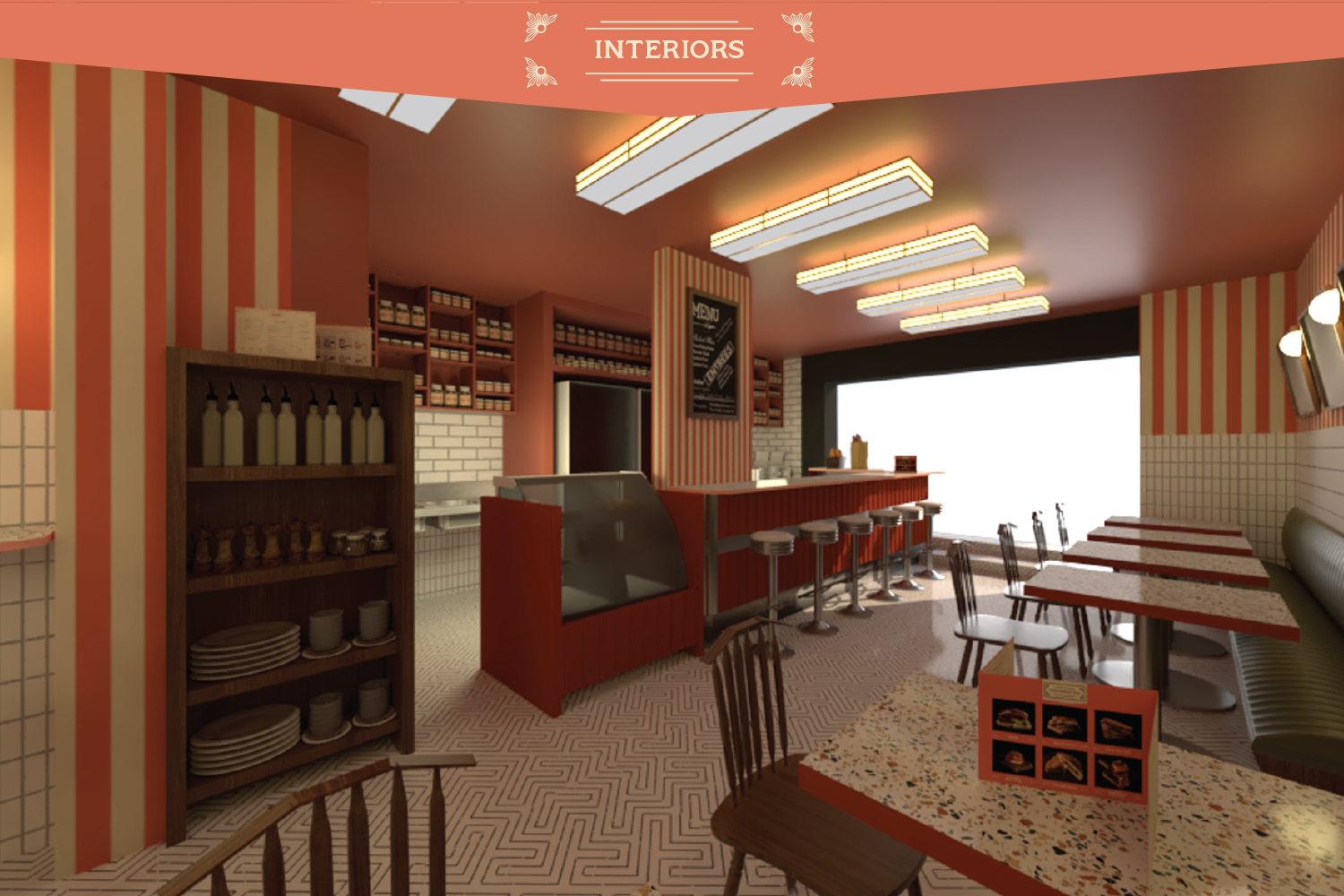

Mananá World Deli’s inspiration and food comes from traditional NY Delicatessens like Kat’z and Russ & Daughters, but also from the classic “American Diner” we are so often used to see in film and arts.
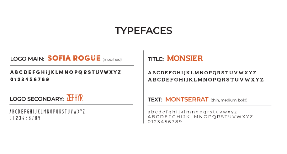
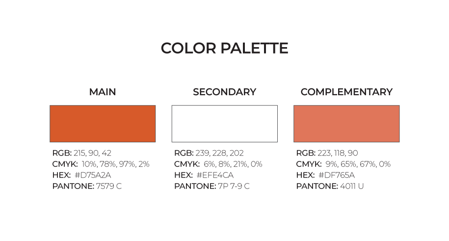
Taking this into account we decided to create a style that evoked 1930’s/40’s labels combining bold geometric shapes, organic decorative elements and a flat but busy design that combines both Deco and Nouveau principles. The typefaces we chose mean to be simple, yet stylized in the early century fashion, using a sans serif type for the main title and a serif style for the title design.
The vision for the brand was to create a style that looked old and reminded of the first half of the nineteen century without falling for the “Vintage Diner” stereotype that we find impersonal and overused.